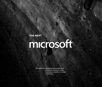
A very smart project is underway by a 21-year-old design student in Los Angeles. The goal: update Microsoft’s branding and messaging in three days.
Judging by the reaction, Andrew Kim has hit a tap root of opinions out there. So far, there are more than 188 comments on Hacker News about his speculative design project.
Microsoft is that company we love to hate but so want to make better. It’s evident in Kim’s initial posts that he, too, wants Microsoft to be something , something better. First, though, he makes a disclaimer that in itself is a reminder of the classic warning messages we grew up seeing on Marlboro ads and billboards. (See it in the fine print below)
Kim’s spec redesign starts by setting the tone. Microsoft is corporate and conservative. It’s outdated. Gaming and Kinect represent the company. That in itself is interesting. Microsoft’s DNA is in the enterprise. Its Office products set the tone for the age of the IT empire. Not anymore — that’s the past. He contrasts Microsoft to Apple and Google. He says Apple is about design and engineering. It’s huge and controlling. It’s friendly and easy to use. He writes: “Google is the search engine, right?” Ha! “Don’t be evil,” he writes. It’s a “great place to work,” round out his descriptions.
For Kim, Microsoft needs to counter Apple and Google’s friendly advertising with bold branding that shows it represents the future.”Be science fiction.”
Funny, Kim sees Microsoft as square when it should be slate. Does he know about Microsoft’s former “Slate,” brand? Regardless, Kim’s branding is modern. It’s flexible. And it’s not Windows.
Windows is over. It’s outdated. It represents the past. Windows Phone and Surface are hindered by the Windows brand.


0 comments:
Post a Comment