Android's charge to the top of the smartphone tree has been driven by some genuinely stellar smartphones.
But for every belting blower running the OS, there's been a fair few flops that brought shame and dishonour on the platform. Here's our very idiosyncratic guide to the worst Android phones of all time.
1 T-Mobile G1
ech types often dub the T-Mobile G1 'the O.G of Android phones'. That’s purely because it was the first one. In no sense does that bad-ass sobriquet reflect that the phone is a bad-ass bit of kit.
Glitchy and laggy, it wasn't much fun to use. Then there was the way it rinsed the battery. And that’s before you even get to its trifling 192MB of internal storage space that meant that getting OS updates was a no-no very early on the handset's lifecycle.
But sealing the deal was that because G1 featured a physical QWERTY keyboard and racked up a million or so sales, it paved the way for a slew of similar phones - despite the fact that Android is optimised for touchscreen handsets.
All those keyboards did was cut back on screen real estate that would have made for a much better user experience. And held Android back from becoming a viable challenger to Apple a lot sooner.
2 Sharp Aquos Hybrid
Back in the early 2000’s Motorola’s clamshell RAZR phones were the last word in cutting-edge cool. That was then, though.
Fast forward to 2011 and Aquos attempted to revive the form factor with the Hybrid.
You couldn’t fault the specs. It shipped with the at-the-time latest 2.3 version of Android and rocked a 16-megapixel camera.
But we just couldn’t get past the fact that it was so fugly. And much more importantly, pointlessly cut back on screen space.
By choosing the clamshell design, Aquos ruined what would otherwise have been a very welcome addition to the Android line-up.
3 Sony Ericsson Xperia Mini Pro
The Xperia Mini Pro was another keyboard-toting Android phone, whose chief apparent virtue was that it was also very compact indeed.
Except that it wasn’t actually a virtue at all.
In hindsight, the idea of shrinking Android phones as though they were old-fashioned feature handsets seems absurd in the era of the Galaxy Note and the growing number of smarties with ever-increasing display sizes.
But no phone proved that more decisively than the incredibly fiddly to use Mini, which featured a screen that was too pokey for comfort and a keyboard that was stiff and unresponsive. That meant both input methods were a failure. And that’s not good enough.
4 Kyocera Echo
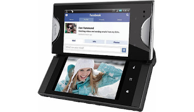
This two-screen number was another attempt to turn the big book of Android phone design upside down. Unfortunately, it was stymied because the second display was little more than a novelty and added nothing to the Echo other than extra bulk.
Add to that low-grade specs (think: single core processor and five-megapixel camera) and it's hard to see what Kyocera thought it was bringing to the party.
5 Sony Xperia Play
For years before the so-called PlayStation phone arrived, it was the subject of excitable chatter from tech types and gamers alike.
That eagerness evaporated within minutes of the handset landing in a blaze of publicity at lavish Sony Ericsson launch events.
With controls that were unresponsive and plasticky, a selection of creaky, dusty PSOne games and shoddy build quality, the Play was rotten as a console.
Much worse for its fortunes, though, was that it was a gadget that showed that Sony Ericsson fundamentally misunderstood why people are ditching complex console titles for throwaway mobile games.
The result? A flop on a scale not seen since the Gizmondo.


0 comments:
Post a Comment